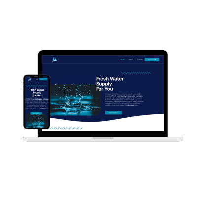

Websiteistic, a leading web development agency renowned for their expertise and creativity, took on the task of creating a remarkable website for Deslippe Water Source. In this article, I will explore the process by which Websiteistic brought Deslippe Water Source’s vision to life, resulting in a visually captivating and user-friendly website.
Understanding Deslippe Water Source’s Goals: Websiteistic initiated the project by conducting in-depth consultations with Deslippe Water Source to gain a comprehensive understanding of their goals, target audience, and desired functionalities for the website. This crucial step allowed Websiteistic to align their creative efforts with the unique requirements of Deslippe Water Source, ensuring a tailored solution that effectively communicated the company’s offerings and values.
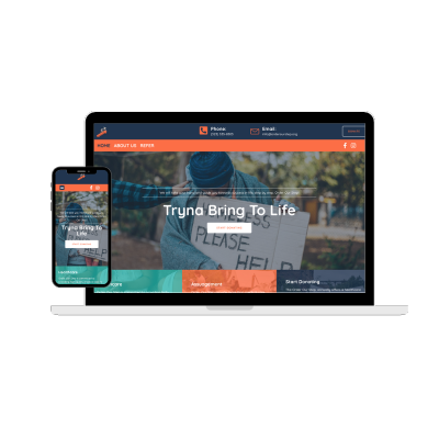
Design and User Experience: I crafted a visually appealing and intuitive design that showcased the essence of Deslippe Water Source. By combining elements of modern aesthetics and user-centric design principles, and created a captivating interface that engaged visitors from the moment they landed on the website.
The layout was thoughtfully organized, allowing visitors to easily navigate through the various sections and find the information they were seeking. The use of visually appealing graphics, high-quality images, and compelling typography enhanced the overall user experience, conveying Deslippe Water Source’s professionalism and commitment to excellence.
Development and Custom Code Integration: Once the design phase was complete, I brought the website to life. I utilized industry-standard web technologies, such as HTML and CSS, to ensure optimal performance, security, and scalability.
I incorporated custom code to enhance the website’s functionality, specifically to address the need for a custom form that accommodated the unique requirement of including an “Amount” field. This was achieved by leveraging HTML and CSS to create a customized form that seamlessly integrated with the overall design of the website.